English
 Arabic
 French
 Spanish
 Portuguese
 Deutsch
 Turkish
 Dutch
Dutch
 Italiano
 Russian
 Romaian
 Portuguese (Brazil)
 Greek
Greek
Is Your Surgical Supply Store and Medical Equipment Shop Offering the Best Value?
Health |
2026-08-03 04:48:10
 Advertise With Us
 About Us
 Terms And Conditions
 Privacy Policy
Mostra tutti i risultati
Privacy Policy
Mostra tutti i risultati

Passa a Pro
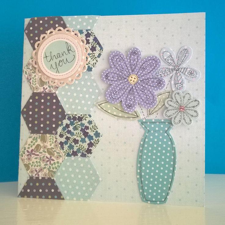
A beautifully designed greeting card leaves a lasting emotional impression. It communicates thoughtfulness before a single word is read. The design quality signals how much you value the recipient. Poor design undermines even the most heartfelt written message inside. Understanding the core design principles helps you create something truly beautiful. These tips apply whether you are designing for personal or professional purposes.
Every great card design begins with a clear creative direction. Before choosing colors or fonts, define the emotional tone first. Ask yourself what feeling the recipient should experience immediately. A birthday card should radiate joy, warmth, and celebratory energy. A sympathy card requires restraint, softness, and quiet sincerity. Defining the tone guides every subsequent design decision naturally.
Different occasions demand entirely different visual languages. A wedding card requires elegance, romance, and refined visual sophistication. A graduation card should communicate achievement, ambition, and forward-looking optimism. A holiday card benefits from warmth, festivity, and familiar seasonal imagery. Matching the visual design to the occasion creates immediate emotional resonance. Recipients feel the occasion is honored before they open the card.
Personalizing the design to the recipient's taste elevates the entire experience. Someone who loves minimalism will appreciate clean lines and ample space. A creative, bold personality may respond better to rich colors and expressive illustration. Knowing the recipient's preferences allows you to make intentional design choices. These choices communicate that you truly see and know the person. That recognition is what transforms a card into a cherished, personal gift.
Color is the most powerful and immediate tool in any designer's kit. It communicates emotion before the brain has time to read words. Warm tones like red, gold, and orange convey energy, love, and celebration. Cool tones like blue, sage, and lavender suggest calm, sincerity, and reflection. Neutral palettes of cream, beige, and charcoal feel sophisticated and timeless. Choose your palette based on the emotional response you want to create.
A focused color palette creates stronger visual impact than a scattered one. Limit yourself to two or three colors for any single card design. One dominant color anchors the composition with visual confidence. A secondary color adds contrast and supporting interest without competing. A third accent color, used sparingly, adds a moment of surprise. This disciplined approach produces beautiful results with satisfying visual coherence.
Color can guide the viewer's eye through your design intentionally. Darker, richer tones naturally draw the eye before lighter ones. A vibrant accent color placed on the most important design element commands attention. Supporting elements in quieter, muted tones recede appropriately. This hierarchy ensures the recipient processes your design in the intended sequence. Purposeful color hierarchy creates a polished, professional design result every time.
Typography is often the most underestimated element in card design. The fonts you choose communicate personality and tone powerfully. A flowing script font evokes romance, elegance, and feminine warmth. A bold serif conveys tradition, authority, and distinguished character. A clean sans-serif communicates modernity, clarity, and contemporary sophistication. Choosing the right font is as important as choosing the right words inside.
Pairing two complementary fonts creates dynamic visual interest and clear hierarchy. A decorative script pairs beautifully with a clean, readable sans-serif. A heavy display font pairs well with a delicate, lightweight secondary typeface. The contrast between fonts creates visual rhythm that guides the eye through the design. Avoid pairing two decorative fonts, as they compete and create visual chaos. One expressive font and one restrained font is the most reliable pairing principle.
Beautiful typography must remain readable to serve its primary communication purpose. Decorative fonts should be used for short headlines or names, not body text. Body copy inside the card should always be in a clean, highly readable font. Line spacing should be generous enough to prevent visual crowding and fatigue. Text should contrast strongly against the background for comfortable reading. Style and readability are not mutually exclusive when approached with design discipline.
The physical properties of your card communicate quality before anything else. A thick, substantial cardstock feels premium and intentional in the hands. Thin stock undermines the perceived quality of even the best design. Paper texture adds a tactile dimension that engages the sense of touch. Coated papers create rich, vibrant color reproduction for illustrative designs. Uncoated papers create a warm, natural feel suited to organic, handcrafted aesthetics.
Special finishing techniques elevate a good design into something truly extraordinary. Foil stamping adds metallic brilliance that commands immediate visual attention. Soft-touch laminate creates a velvety surface that feels undeniably luxurious. Embossing raises specific design elements into three-dimensional sculptural relief. Spot UV applies selective gloss coating that creates beautiful light and shadow contrast. Each finishing technique adds a layer of sensory richness that printed ink alone cannot achieve.
Mid-way through the design and production process, choosing custom greeting cards printing with a professional provider unlocks access to specialty papers and premium finishes. Professional print partners can execute complex finishing combinations with precision. The result is a card that looks and feels genuinely extraordinary. Recipients immediately notice and appreciate the quality of professionally produced cards.
Strong imagery creates an emotional impact that words and color alone cannot. Illustration style communicates personality before a single word is processed. Delicate botanical watercolor illustrations feel soft, romantic, and artistically refined. Bold geometric patterns communicate confidence, modernity, and graphic design awareness. Playful character illustrations suit children's cards and lighthearted personal relationships. Choosing imagery that matches the occasion and recipient creates instant emotional alignment.
White space is not empty space; it is an active design element. Generous white space creates breathing room that elevates every other design element. Overcrowded card designs feel anxious, cluttered, and visually exhausting to the eye. White space allows the eye to rest and focus on what truly matters. Premium card designs consistently use more white space than their budget counterparts. Adding more white space to your design immediately communicates quality and confidence.
The final step is translating your design concept into a beautifully produced physical card. Preparing high-resolution files ensures crisp, sharp printing at every scale. Checking color profiles — CMYK for print, not RGB — prevents color shift surprises. Requesting a physical proof before approving the full print run prevents costly errors. Reviewing the proof in different lighting conditions ensures accurate color assessment. A carefully produced card is the physical manifestation of your creative intention and personal care.